Choosing Coloured Bifold Doors: Buyer’s Guide
Table of Contents
Coloured Door Design Trends
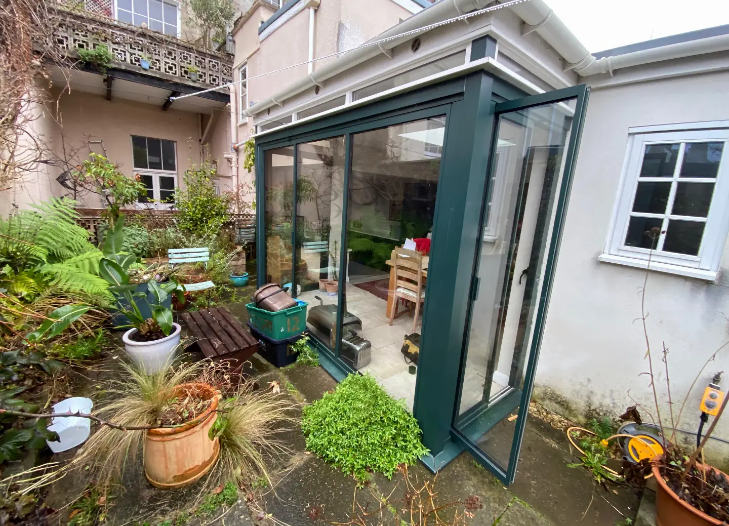
British homeowners increasingly choose coloured bifold doors to express their personal style and make bold statements with their glazing choices. Paint colours range from subtle pastels to dramatic darks, with each shade bringing its own character to modern and traditional homes.
Rising Stars Among Door Colours
Deep navy has surged past anthracite grey as a go-to choice for coloured bifold doors in British homes. Rich earth tones like terracotta and bronze offer warmth while maintaining sophistication, particularly in powder coated aluminium doors that promise lasting vibrancy. Sage green brings natural calm to contemporary spaces, working brilliantly with both brick and rendered walls.
Many homeowners now pair coloured door frames with contrasting handles and hardware, creating striking visual interest without overwhelming the eye. Soft pink, once confined to period properties, has found new life in modern builds where it adds unexpected charm to minimal facades.
Heritage-Inspired Door Palettes
British architectural traditions strongly influence today’s paint choices for coloured bi fold doors. Racing green draws from classic country estates, while burgundy recalls Victorian splendour. Darker shades dominate heritage schemes, lending gravitas to even the most contemporary door designs.
Paint manufacturers have revived forgotten historic pigments, offering authentic period options that suit conservation areas. Modern production methods ensure these traditional colours maintain their depth on current materials, giving homeowners the best of old and new.
Breaking Away from Grey
While light colour options remain popular, bold jewel tones have carved out their place in British home design. Copper and bronze finishes offer metallic richness without the industrial feel of raw aluminium. These warmer alternatives to grey work particularly well with exposed brick and natural stone.
Coloured glass doors introduce subtle tints that shift with changing daylight, creating dynamic effects without overwhelming the space. Amber and bronze glass panels complement wooden frames beautifully, adding depth while maintaining views through the glazing.
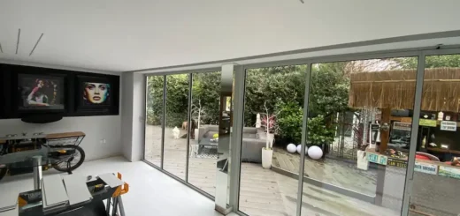
How Coloured Bifold Doors Shape Your Space
Your choice of door colour powerfully influences the mood and atmosphere of every room. Paint shades can make spaces feel larger, cosier, brighter or more intimate, working alongside natural light to create different effects throughout the day.
Using Light to Your Advantage
Morning sun brings out different qualities in coloured bifold doors compared to evening light. East-facing installations might shine in saturated shades like forest green or navy, while west-facing doors often work better in softer tones that won’t create glare during sunset.
Slim profile bifold doors in lighter shades help maintain brightness even when closed, preventing darker colours from overpowering smaller spaces.
Natural light changes how we perceive colour intensity across seasons. A deep blue that looks perfect in summer sunshine might appear too dark during winter months. Testing paint samples at different times of day reveals how colours shift – what seems like an ideal neutral tone in showroom lighting could look completely different in your home.
Light and Perception
Paint colours influence our perception of depth and distance. Darker shades make the frame appear to recede, drawing attention to the view beyond. Lighter colours can make the doors feel more present in the space, creating a stronger visual barrier between inside and out.
Colour Psychology in Living Spaces
Cool-toned coloured bifold doors bring a sense of calm to busy family areas. Blues and greens mirror nature’s palette, making them particularly suited to garden-facing installations. Warmer tones like terracotta or bronze create an inviting atmosphere, especially valuable in north-facing rooms that receive less direct sunlight.
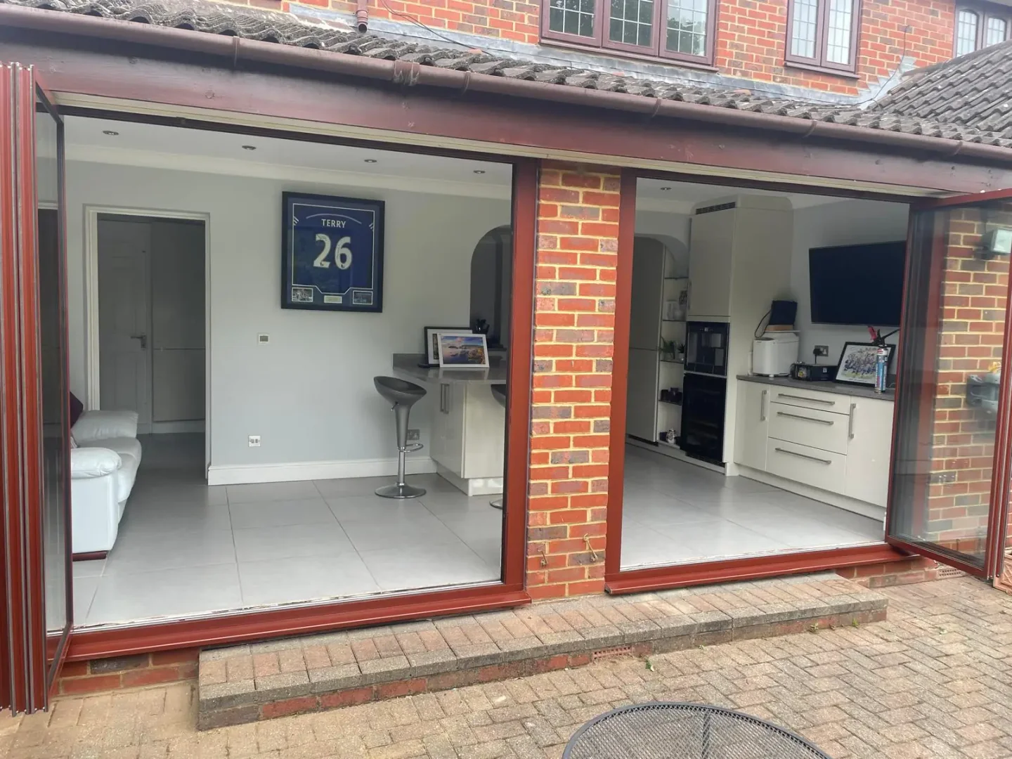
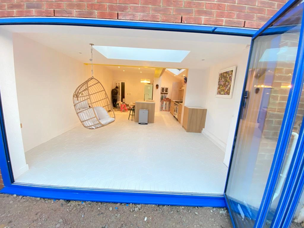
Dual colours offer flexibility – matching interior colour scheme requirements while coordinating with external materials. This approach lets you maintain a consistent indoor palette without compromising on kerb appeal. Dark grey external frames paired with white interiors remain a popular choice for homeowners seeking this balance.
Many people gravitate toward popular colours like black or grey without exploring alternatives that might better suit their space. Rich purples and deep wines can bring sophistication to dining areas, while sage or olive tones create a natural connection to garden greenery. These unexpected choices often prove more satisfying than following trends.
Making Small Spaces Work
Paint choice becomes especially important in compact rooms. Coloured bi fold doors in pale shades help maintain an open feel, while darker options risk making the space feel enclosed. The frame finish matters too – matt surfaces absorb light while glossier finishes reflect it back into the room.
White and cream aren’t the only options for improving brightness. Pearl grey, soft sage, and pale blue can open up a room while adding character. These lighter options work particularly well in properties where planning restrictions limit structural changes but allow colour customisation.
Frame size also plays a part in colour impact. Narrower frames let coloured bifold doors make a statement without dominating the view. Wider frames in strong colours need more careful thought, as they’ll have a bigger impact on the overall room design.
Coordinating with Architecture
Period properties often suit heritage paint collections that complement original features. Victorian homes can carry off stronger colours, while Georgian architecture typically works better with more restrained choices. Modern properties offer more flexibility, though the existing materials should guide colour selection.
External materials influence door colour choices too. Red brick harmonises with different shades than white render or stone cladding. The surrounding window frames, guttering, and roof tiles all contribute to the overall effect. Getting these relationships right helps coloured bifold doors improve rather than clash with your home’s character.
Paint samples viewed in isolation rarely tell the whole story. They need evaluation against adjacent materials, in different lights, and from various distances. What looks striking up close might appear jarring from the street, while subtle differences between similar shades become more apparent over larger areas.
Practical Colour Combinations
Selecting paint colours requires careful thought about how they’ll work with existing materials, furnishings, and architectural features. The right combination pulls a space together, while poorly matched shades can make even the finest coloured bifold doors look out of place.
Working with Period Features
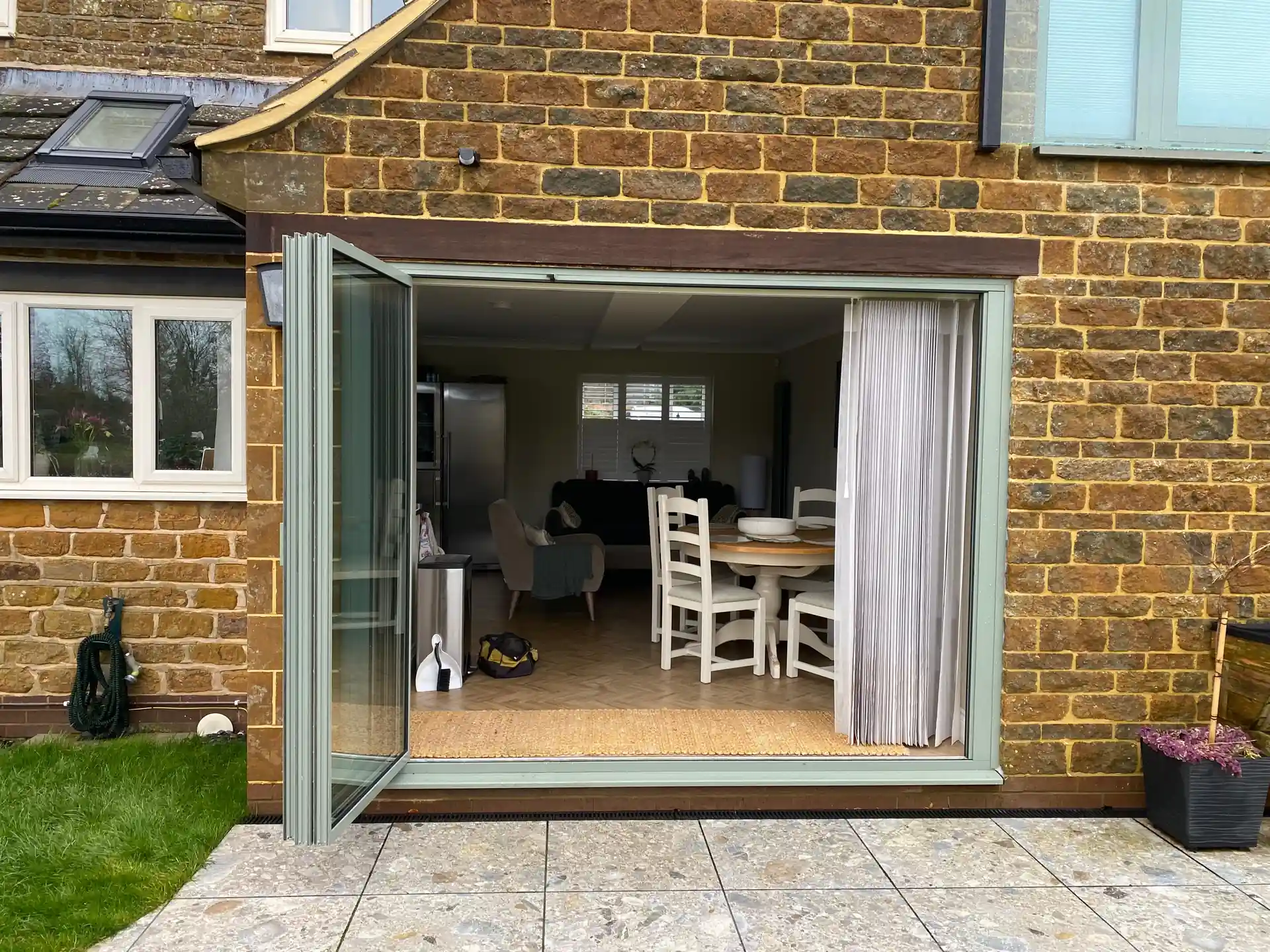
Heritage aluminium doors open up new possibilities for period properties. Original Victorian and Edwardian homes often featured painted wooden doors in rich, deep shades – modern coloured bi fold doors can echo these traditional choices while offering improved thermal performance. Paint manufacturers now offer specific collections designed to complement cornicing, dado rails, and other architectural styles common in British period homes.
Many older properties benefit from powder coating in historical shades that match existing woodwork. Deep greens and blues drawn from heritage palettes let coloured bifold doors sit naturally alongside original features. Paint matching services can recreate exact shades from existing architectural elements, ensuring new installations complement century-old details.
Paint choices should respect the age and character of your property. Georgian homes traditionally used lighter, more restrained colours, while Victorian properties embraced darker, more opulent shades. Modern colour-matched bifolds can reference these historical preferences while bringing contemporary performance.
Balancing Indoor and Garden Elements
Garden-facing coloured bifold doors need to work with interior fixtures and outdoor landscaping. Planting schemes influence colour success – evergreen gardens provide year-round colour stability, while seasonal changes might require more neutral door choices.
Gardens with grasses and stone might suggest warmer metal finishes, while lush plantings could point toward forest greens or deep blues.
Natural materials near the doors shape colour decisions. Stone patios have underlying tones that can clash with certain paint choices. Wooden decking ages and changes colour, so door finishes should anticipate this evolution. Coloured aluminium bifold doors must coordinate with these elements through all seasons and weather conditions.
Material Harmony
Brick and stone walls each carry their own colour palette. Red brick contains subtle purple and orange notes that fight against some paint colours. London stock brick works differently with cool versus warm tones. Testing paint samples against all nearby materials reveals unexpected clashes or harmonies.
Balancing Bold and Neutral
Strong colours demand careful handling. Black frames create striking contrasts but can overpower delicate period details. Dual colour options let you moderate the impact, perhaps using darker shades outside while keeping interior spaces lighter. This flexibility helps coloured bifold doors fit into complex decorative schemes.
Paint finish affects how bold colours read in different lights. Matt finishes soften strong shades, while gloss intensifies them. Some homeowners choose contrasting finishes for interior and exterior surfaces, using different levels of sheen to control reflectivity and visual weight.
Neutral walls don’t always demand neutral doors. Strong door colours can anchor a pale room, creating focus without overwhelming the space. Even subtle variations in neutral paint shades can create sophisticated layering effects – warm versus cool greys, or different intensities of the same colour.
Working with Existing Elements
Windows and other doors influence bifold colour selection. White window frames might suggest matching white bifolds, but contrasting coloured bifold doors often prove more interesting. Existing door hardware also guides colour choices – brass handles read differently against various paint colours.
Paint samples should cover enough area to judge their real impact. Small swatches rarely reveal how a colour will feel at full scale. Viewing large sample panels at different times helps predict how coloured bifold doors will look once installed.
Finding Your Perfect Coloured Bifold Doors
Paint selection requires patience and methodical testing. RAL colours seen in brochures or online rarely match their real-world appearance, making physical samples essential for accurate colour judgement.
Sampling and Testing
Paint samples need viewing under different conditions before making final decisions. Modern glass doors can change appearance as light shifts throughout the day. Morning sun brings out different qualities compared to evening light, while artificial lighting creates its own effects after dark.
Testing should replicate real-world conditions as closely as possible. Large sample panels help gauge the true impact of coloured aluminium frames in your space. Place these samples against adjacent walls, floor materials, and furnishings to spot potential clashes early.
Many homeowners overlook the importance of viewing samples from different distances. A colour that looks perfect up close might appear too strong when viewed from the garden, or too weak when seen from across the room. Walking around with samples at various times lets you spot issues before committing.
Sample Testing Checklist:
- View in direct sunlight
- Check under cloudy conditions
- Test with interior lights
- Examine at different times of day
- Look from various distances
- Compare against existing materials
- Check against furniture fabrics
Common Colour Mistakes
Paint choices that look striking in showrooms often prove overwhelming in real homes. Coloured bifold doors need to work with existing elements rather than fighting against them. Strong shades can dominate spaces intended to focus on garden views or interior features.
Dual colour options solve many common issues by allowing different treatments for interior and exterior faces. This flexibility lets coloured bi fold doors complement internal colour schemes while coordinating with external materials. Many homeowners find this approach offers the best balance between kerb appeal and interior harmony.
Coloured aluminium bifold doors bring special challenges. Metal surfaces reflect light differently than painted wood or PVCu, creating unexpected variations in how colours appear. Gloss levels change perception too – high-gloss finishes intensify colours while matt surfaces appear more subdued.
Future-Proofing Your Choice
Paint trends change quickly, but door installations represent substantial investments meant to last many years. Classic colours tend to maintain their appeal longer than current fashions. Navy, forest green, and warm greys have proved their staying power across decades of changing tastes.
Neutral external colours paired with bolder interior shades often provide lasting satisfaction. This approach lets homeowners update their interior style without needing to change the exterior appearance. Future buyers might appreciate this flexibility too, though resale value shouldn’t dictate colour choices entirely.
Some paint colours work better in certain climates. Darker coloured bifold doors absorb more heat in sunny locations, while lighter shades better suit cooler regions. Local weather patterns, sun exposure, and seasonal changes all shape how paint colours perform over time.
Paint Quality and Longevity
Professional powder coating provides superior durability compared to wet paint systems. Modern coating technologies resist fading, chalking, and colour change even in challenging weather conditions. These advanced finishes maintain their appearance far longer than traditional paint applications.
Surface preparation determines long-term colour stability. Even tiny imperfections in the base material can lead to premature coating failure. Reputable manufacturers follow strict quality control processes to ensure consistent colour reproduction and coating adhesion.
UV exposure poses particular challenges for exterior paint finishes. South-facing coloured bifold doors face more intense sun exposure than north-facing installations. High-quality coating systems include UV inhibitors to maintain colour stability, though some degree of fading remains inevitable over many years.
Long-term Performance
Regular cleaning helps maintain paint appearance. Different finishes require specific cleaning approaches – what works for one type might damage another. Manufacturer guidelines specify appropriate cleaning methods and frequencies for various coating types.
Paint warranties often include colour stability guarantees. These typically specify acceptable levels of colour change over time, measured using standardised techniques. Understanding warranty terms helps set realistic expectations for long-term appearance.
Making Coloured Bifold Doors Work in Any Setting
Paint choices must respond to a building’s architectural style, surroundings, and intended use. Different properties demand different approaches – while copper brown might suit a rustic conversion, urban homes often need sharper, more defined colours.
Modern Minimalist Homes
Contemporary architecture favours strong contrasts and clear lines. Black aluminium bifold doors create powerful statements in modern settings, framing views with crisp precision. Minimal frames keep the focus on clean geometry rather than ornate details.
Pure whites and subtle greys dominate many modern schemes, but coloured bifold doors offer opportunities to break this monotony. Deep blues and greens provide sophisticated alternatives to standard black, maintaining modern simplicity while adding depth and interest.
Material choices in modern homes shape door colour decisions. Polished concrete floors reflect colours differently than timber or tile. Metal cladding and large glass expanses create their own reflections and shadows. Paint finishes need to work with these contemporary materials without competing against them.
Frame Proportions
Slim frames change how colours read in the space. Narrower sections of colour appear less intense than wider profiles, allowing stronger shades on minimal frames. Larger frames need more restraint to avoid overpowering the glazing.
Period Properties
Victorian and Edwardian homes suit rich, deep colours that echo their original architectural palette. Coloured bi fold doors in heritage greens and blues reference traditional joinery while bringing modern performance. Original features like stained glass or decorative tiles provide colour cues for new installations.
Bay windows and ornate stonework typical of period properties need careful colour coordination. Paint choices should respect existing architectural elements without mimicking them exactly. Slight variations in shade or tone often work better than exact matches.
Many period homes face planning restrictions on external changes. Paint colour offers scope for personalisation within these constraints. Even listed buildings sometimes permit carefully chosen coloured bifold doors that complement protected features.
Mixed-Style Interiors
Houses often combine elements from different periods and styles. Extensions add contemporary spaces to period properties, while modern homes incorporate traditional materials. These mixed environments need thoughtful colour selection to create visual connections between different areas.
Paint can help resolve architectural tensions. Coloured bifold doors bridging old and new sections of a home need to acknowledge each style without favouring either. Neutral metallic finishes often succeed here, offering sophistication without strong period associations.
Material combinations common in renovated properties present special challenges. Exposed brick meeting rendered walls, timber alongside steel – each junction needs careful colour consideration. Door finishes must work across these material boundaries without creating jarring contrasts.
Coastal and Country Properties
Maritime environments demand robust finishes that resist salt spray and strong sun. Coastal homes often suit softer colours that echo beach and sea tones. These natural palettes help coloured bifold doors settle into seaside settings.
Rural properties face different environmental challenges. Agricultural surroundings suggest earthier colour choices, while woodland settings might point toward forest shades. Natural light tends to be clearer in countryside locations, making colours appear stronger than in urban environments.
Environmental Factors
Sun exposure varies by location and orientation. South-facing coloured bifold doors endure more intense UV light than north-facing installations. Local climate conditions – salt air, industrial pollution, tree pollen – all influence how different finishes perform over time.
Urban Homes
City properties often need to balance personal style with neighbourhood context. Street-facing coloured bifold doors should coordinate with surrounding architecture without sacrificing individuality. Urban settings typically tolerate bolder colour choices than rural areas.
Paint colours read differently under city lighting conditions. Streetlights, neighbouring buildings, and reduced natural light alter how colours appear after dark. Urban homes often benefit from dual-tone approaches – stronger external colours paired with subtler interior finishes.
Space constraints in city homes make colour impact more intense. Smaller rooms magnify the presence of coloured bifold doors, requiring careful balance between statement and subtlety. Urban gardens often form key views, making door colours essential to the overall design scheme.
About SunSeeker Doors
With over 20 years of experience, SunSeeker Doors remains at the forefront of door design with our quality-tested patio doors and related products, including the bespoke UltraSlim aluminium slide and pivot door system, Frameless Glass Doors, and Slimline Sliding Glass Doors. All of our doors are suitable for both internal and external use.
To request a free quotation, please use our online form. You may also contact 01582 492730, or email info@sunseekerdoors.co.uk if you have any questions.